5 Design Brief Examples You Can Practice With Today
Example 1: Branding Brief for a Boutique Coffee Roaster
A specialty coffee roaster is rebranding ahead of opening its first physical location. The brand needs to feel artisanal but approachable, not intimidating to newcomers, with a visual identity that works equally well on packaging and in-store signage.
Goal: Build brand recognition among new, non-expert coffee drinkers, not just enthusiasts.
Deliverables: Logo suite, packaging system for 3 coffee bags, in-store signage direction.
Constraint: Must work in a single Pantone spot color for packaging cost reasons.
Why it works: This brief forces a real trade-off, approachable vs. artisanal, and a genuine production constraint (single spot color), both of which push you past a purely decorative solution.
Example 2: Web Design Brief for a Subscription Meal Kit Landing Page
A meal-kit startup needs a landing page focused on a single conversion goal: sign-ups for a free trial. The audience is time-poor professionals comparing several similar services.
Goal: Maximize free trial sign-ups above the fold.
Deliverables: Desktop and mobile landing page design, 3 content sections minimum.
Constraint: Must clearly differentiate from at least two named competitors' visual styles.
Why it works: Conversion-focused briefs test a different skill than pure branding, hierarchy, clarity, and persuasion, and the competitor-differentiation constraint prevents a generic "meal kit template" outcome.
Example 3: Packaging Brief for a Sustainable Skincare Line
A skincare brand is launching a new product line using recycled packaging materials, targeting environmentally conscious buyers willing to pay a premium.
Goal: Communicate sustainability and premium quality simultaneously: neither should undercut the other.
Deliverables: Primary packaging for 3 SKUs, shelf-ready secondary packaging concept.
Constraint: Design must work in undyed, recycled kraft material: no full-color print.
Why it works: Material constraints are one of the hardest things to simulate on your own, and this brief bakes one in directly, forcing genuinely creative problem-solving instead of relying on color and print effects.
Example 4: Social Media Brief for a Nonprofit Awareness Campaign
A nonprofit needs a template system for a month-long awareness campaign across Instagram and LinkedIn, to be used by a small internal team with no design background after handoff.
Goal: Consistent visual identity across 20+ posts, usable by non-designers.
Deliverables: 5 template variations, brief usage guide.
Constraint: Templates must be editable in Canva, not just static files.
Why it works: Designing for handoff, not just for yourself, is a real-world skill class projects rarely test. This brief specifically evaluates whether your system holds up once someone else is using it.
Example 5: Logo Brief for a B2B SaaS Rebrand
A project management software company is rebranding to appeal to enterprise clients, moving away from its current playful, startup-coded visual identity.
Goal: Signal enterprise credibility without losing all approachability.
Deliverables: Primary logomark, wordmark lockup, favicon-ready icon version.
Constraint: Must remain legible at 16x16px (browser favicon size).
Why it works: Enterprise repositioning briefs are common in real agency work and rarely show up in student projects. The favicon-legibility constraint is a small but realistic technical detail that separates a portfolio piece from a purely decorative logo study.
How to Use These Examples
You can treat any of the five briefs above as a starting point for a portfolio project: write out your interpretation of the goal, sketch a few directions, and design a full response as if this were a real client. For a wider range of categories and fully developed briefs with Art Director feedback, our PRO Design Brief Packs go deeper than the summaries above.
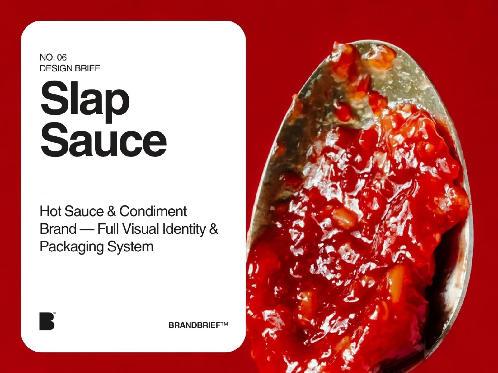
Here's a real sample from our catalog. This is an excerpt from the client brief for SLAP SAUCE, a hot sauce and condiment brand based in Austin, Texas.
"Marcus here. I've been making hot sauce in my garage in Austin for about three years. Started giving bottles to friends, then friends started asking to buy them, and now I need to actually look like a real company. The vibe I'm going for: loud, fun, confident, a little irreverent. I want characters, each flavor should have its own mascot, something people want on a t-shirt."
This is just the opening of the client brief. The full version includes the complete client voice, competitor analysis, buyer personas, and the Art Director's Analysis breaking down what Marcus actually needs versus what he asked for.
Frequently Asked Questions
Q: Can I use these design brief examples directly for my portfolio?
Yes: treat them as real practice briefs and design a full response. Just be clear in your case study write-up that it's based on a practice scenario, not an actual client relationship.
Q: What category of design brief should I practice with first?
Start with whatever category you're weakest in or want to work in professionally: range across 2–3 categories tends to build a stronger, more versatile portfolio than depth in just one.
Q: Do real design briefs always include this many constraints?
Often more. Real client briefs frequently include budget limits, legal restrictions, and stakeholder opinions layered on top of what's shown here, which is part of why practicing with realistic constraints matters.
Want more briefs like these, with full detail and Art Director analysis?
Browse all Design Briefs here.