Dumpling Bar, Visual Identity & Restaurant Brand System

Real briefs. Real clients. The strategic layer your design education skipped.
Each pack contains complete briefs, a raw client brief written in the client's own voice, and a full Art Director's Analysis that tells you what it actually means.
WHAT’S INCLUDED
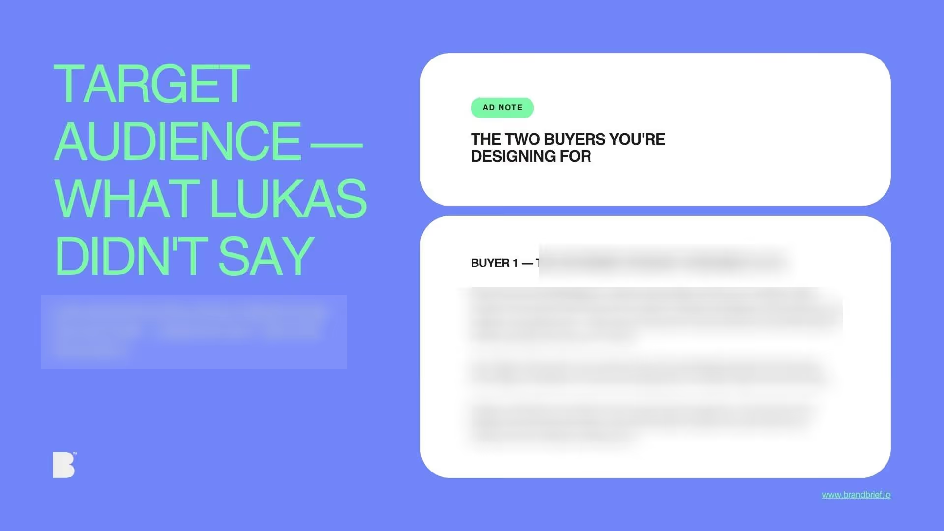
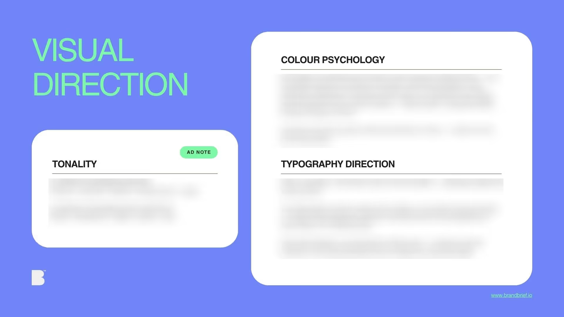
WHY THE ANALYSIS MATTERS
who's on the shelf and what the gap is
Single client brief
+ full Art Director's Analysis
Includes the full Art Director's Analysis — the strategic document agencies charge separately for and most briefs never include.
New briefs added every month.
€29/mo
Cancel anytime.
All current briefs + every new brief published during your active subscription.
Download all design briefs.
What you learn
- How to build a genuinely bilingual brand identity where two scripts have equal visual authority
- Why typeface selection for a non-Latin script requires research and consultation, not creative preference
- What equal visual weight means when two scripts have completely different visual logics
WHY DESIGNERS BUY BRANDBRIEF™ Design Briefs
You get the brief agencies never share.
You stop designing in a vacuum.
You learn to think before you open a file.
You build portfolio pieces that answer real questions.
You practice the skill no one teaches.
You understand why the good work looks the way it does.
You get a realistic project timeline.
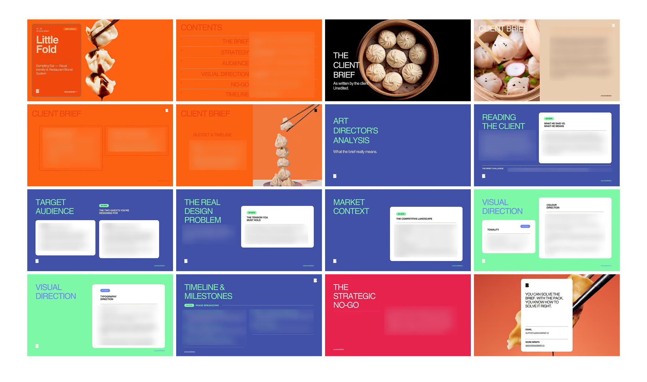
TAKE A LOOK INSIDE
Questions?
Ready to level up?
Single client brief
+ full Art Director's Analysis
Includes the full Art Director's Analysis — the strategic document agencies charge separately for and most briefs never include.
New briefs added every month.
€29/mo
Cancel anytime.
All current briefs + every new brief published during your active subscription.
Download all design briefs.
A professional design brief goes beyond a list of deliverables. The briefs that lead to strong brand identities share three things: a clearly defined competitive position, a specific understanding of who the brand is speaking to, and a strategic direction that makes visual decisions easier — not harder. This is what separates a brief that produces competent work from one that produces work worth putting in a portfolio.
Bilingual brand identity is one of the most technically demanding briefs in restaurant design, and one of the most frequently mishandled. Two scripts, two visual rhythms, two cultural associations, one brand. For a Chinese-American chef who wants both LITTLE FOLD and 小褶 on every touchpoint with equal weight, the design challenge is not aesthetic, it is structural. How do a Latin and a Chinese typeface coexist in the same composition with genuine visual parity? BRANDBRIEF™ Design Brief Packs include the full Art Director's Analysis, covering why Chinese typeface selection requires consultation not preference, how equal visual weight differs from symmetry across scripts, and why decorative use of non-Latin characters is the single most common failure mode in this brief type.
Every brief includes a full Art Director's Analysis — competitive landscape, buyer psychology, visual direction, and the strategic no-go. This is the layer that agencies build internally and never share. Here, it's included.