Specialty Coffee Bar, Visual Identity & Bar System

Real briefs. Real clients. The strategic layer your design education skipped.
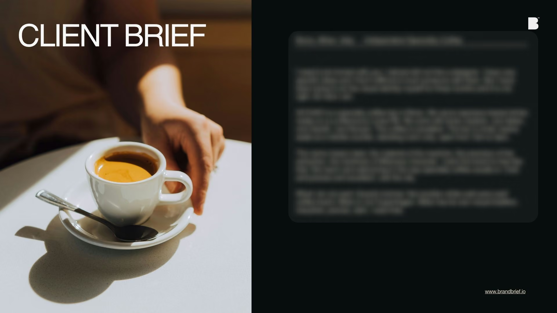
Each pack contains complete briefs, a raw client brief written in the client's own voice, and a full Art Director's Analysis that tells you what it actually means.
WHAT’S INCLUDED
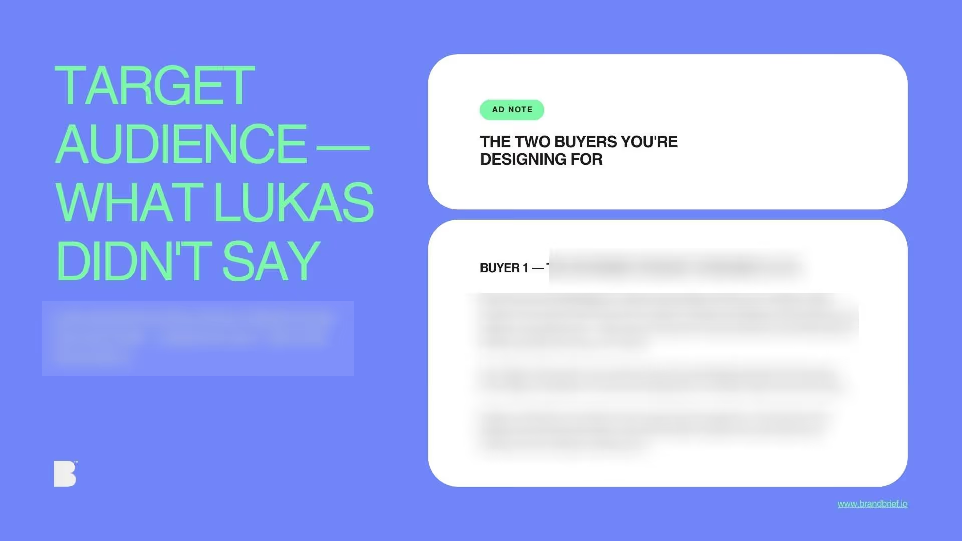
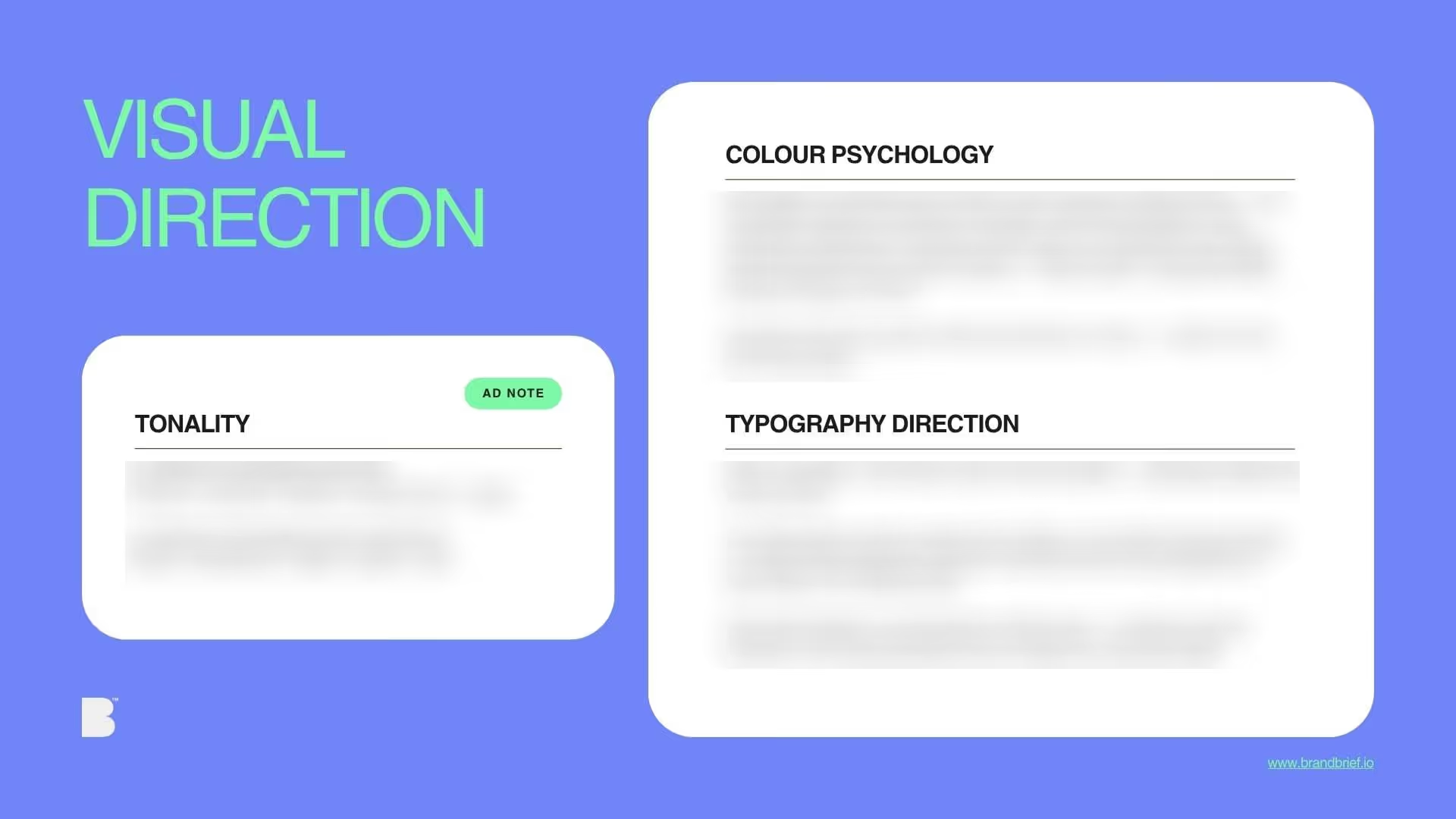

WHY THE ANALYSIS MATTERS
who's on the shelf and what the gap is
Single client brief
+ full Art Director's Analysis
Includes the full Art Director's Analysis — the strategic document agencies charge separately for and most briefs never include.
New briefs added every month.
€29/mo
Cancel anytime.
All current briefs + every new brief published during your active subscription.
Download all design briefs.
What you learn
- How to design within a specific city's visual tradition rather than a global category's visual vocabulary
- Why the specialty coffee aesthetic is Nordic in origin and why that matters for non-Nordic markets
- How to hold precision and warmth simultaneously — the Milanese design legacy
WHY DESIGNERS BUY BRANDBRIEF™ Design Briefs
You get the brief agencies never share.
You stop designing in a vacuum.
You learn to think before you open a file.
You build portfolio pieces that answer real questions.
You practice the skill no one teaches.
You understand why the good work looks the way it does.
You get a realistic project timeline.
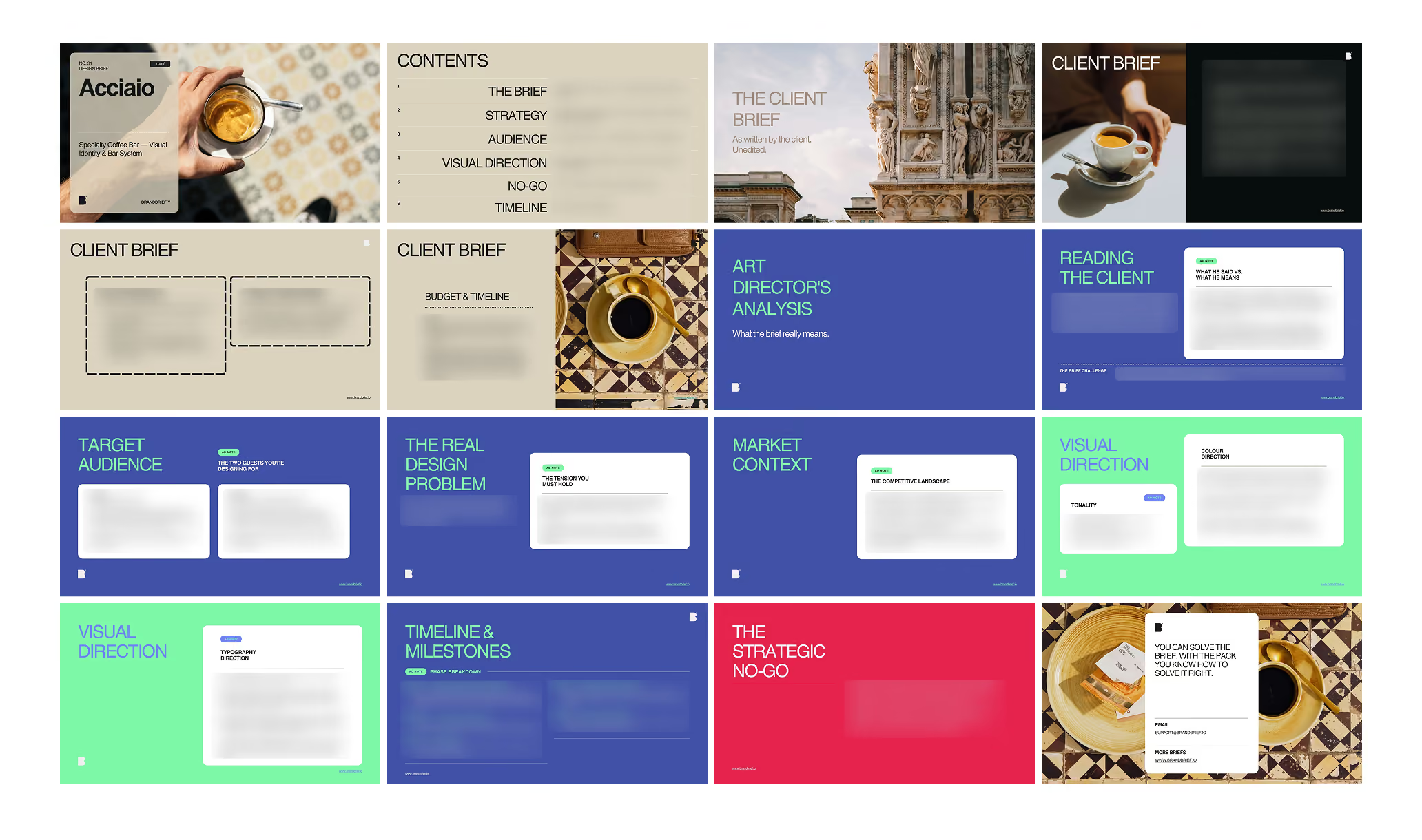
TAKE A LOOK INSIDE
Questions?
Ready to level up?
Single client brief
+ full Art Director's Analysis
Includes the full Art Director's Analysis — the strategic document agencies charge separately for and most briefs never include.
New briefs added every month.
€29/mo
Cancel anytime.
All current briefs + every new brief published during your active subscription.
Download all design briefs.
A professional design brief goes beyond a list of deliverables. The briefs that lead to strong brand identities share three things: a clearly defined competitive position, a specific understanding of who the brand is speaking to, and a strategic direction that makes visual decisions easier — not harder. This is what separates a brief that produces competent work from one that produces work worth putting in a portfolio.
Specialty coffee branding has a problem that is rarely named: it looks the same everywhere. The white-wall-sans-serif-beige-adjacent aesthetic that has colonised specialty coffee from Melbourne to London to New York is Nordic in origin — and it has been applied globally regardless of cultural context. For a Milanese founder who wants a coffee bar that belongs to his city — darker, more precise, more industrial — the brief is an argument against the category default. BRANDBRIEF™ Design Brief include the full Art Director's Analysis — covering the Milanese graphic design tradition and why it matters here, how to hold precision and warmth simultaneously, and why the cup is the primary brand touchpoint in a takeaway coffee context.
Every brief includes a full Art Director's Analysis — competitive landscape, buyer psychology, visual direction, and the strategic no-go. This is the layer that agencies build internally and never share. Here, it's included.