
Premium Organic Apple Juice – Visual Identity & Packaging

Real briefs. Real clients. The strategic layer your design education skipped.
Each pack contains complete briefs, a raw client brief written in the client's own voice, and a full Art Director's Analysis that tells you what it actually means.
WHAT’S INCLUDED


WHY THE ANALYSIS MATTERS
who's on the shelf and what the gap is
Single Brief + full Art Director’s Analysis
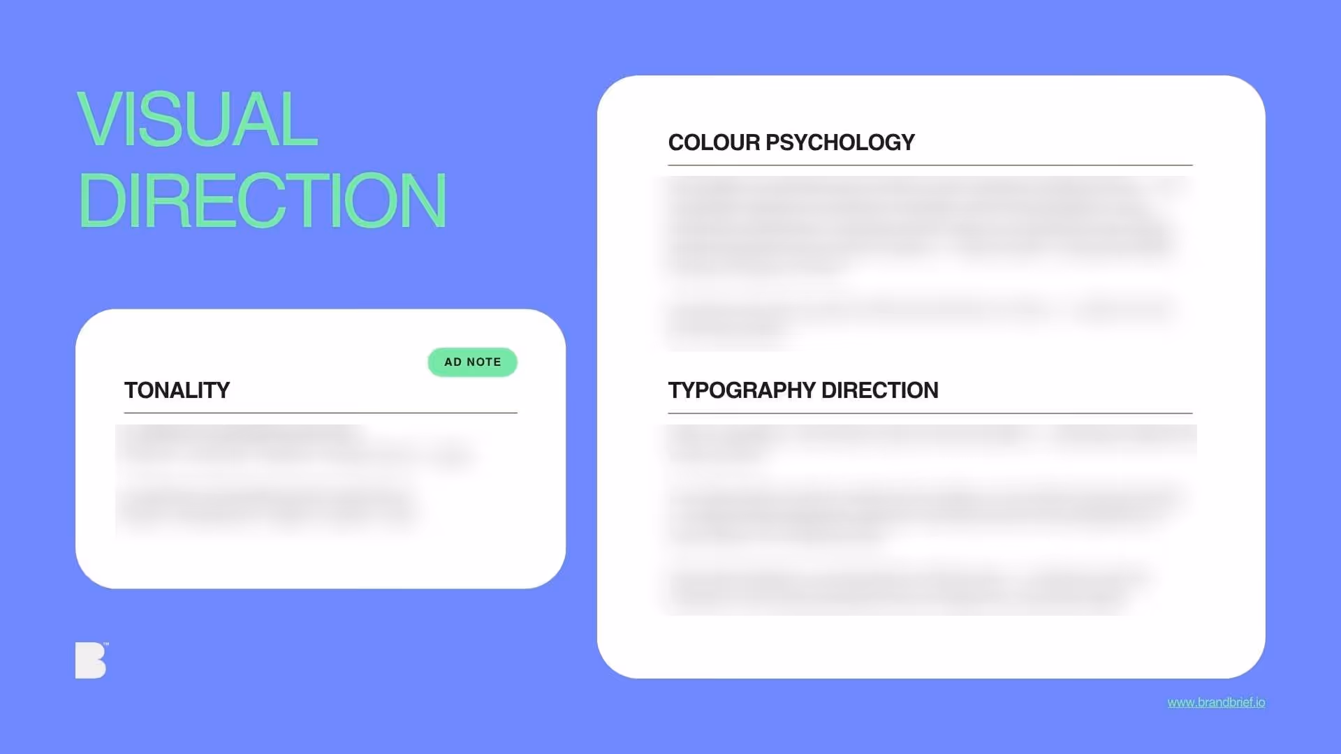
Includes the full Art Director's Analysis — the strategic document agencies charge separately for and most briefs never include.
€ 29,90
€ 74,75
+ 5 Art Direction Analysis
Includes the full Art Director's Analysis — the strategic document agencies charge separately for and most briefs never include.
What you learn
- How to leave a category visually without having to explain yourself
- Why "no green" is a strategic decision, not a limitation
- How heritage brands fail — and how to read the same material differently
- How typography alone communicates premium quality without using a single luxury code
- What the difference is between a brand that shows its story and one that lives it
WHY DESIGNERS BUY BRANDBRIEF™ Design Briefs
You get the brief agencies never share.
You stop designing in a vacuum.
You learn to think before you open a file.
You build portfolio pieces that answer real questions.
You practice the skill no one teaches.
You understand why the good work looks the way it does.
You get a realistic project timeline.
TAKE A LOOK INSIDE

A professional design brief goes beyond a list of deliverables. The briefs that lead to strong brand identities share three things: a clearly defined competitive position, a specific understanding of who the brand is speaking to, and a strategic direction that makes visual decisions easier — not harder. This is what separates a brief that produces competent work from one that produces work worth putting in a portfolio.
In the premium food and beverage packaging category, a strong brief does more than specify label dimensions. It tells the designer which visual territory the brand needs to occupy — and which it must avoid. For a product like a single-origin cold-pressed apple juice, the brief must answer why this brand looks nothing like every other organic product on the shelf, what the buyer already knows before they pick up the bottle, and why restraint is a more powerful design decision than warmth. BRANDBRIEF™ Design Briefs include a full Art Director's Analysis for every brief — including the competitive landscape, buyer psychology, and the strategic no-go that most designers only discover after the first round of feedback.
Every brief includes a full Art Director's Analysis — competitive landscape, buyer psychology, visual direction, and the strategic no-go. This is the layer that agencies build internally and never share. Here, it's included.

