
Artisan Pasta Brand — Packaging & Visual Identity

Real briefs. Real clients. The strategic layer your design education skipped.
Each pack contains complete briefs, a raw client brief written in the client's own voice, and a full Art Director's Analysis that tells you what it actually means.
WHAT’S INCLUDED

WHY THE ANALYSIS MATTERS
who's on the shelf and what the gap is
What you learn
- How to distil an unstructured client brief without distorting it
- Why "affordable" and "cheap" are visual opposites
- How illustration works as character — the difference between a figure that is remembered and one that is forgotten
- What shelf hierarchy means — brand first, product second, character third
- How to build a brand that is just as strong on the tenth encounter as on the first
WHY DESIGNERS BUY BRANDBRIEF™ Design Briefs
You get the brief agencies never share.
You stop designing in a vacuum.
You learn to think before you open a file.
You build portfolio pieces that answer real questions.
You practice the skill no one teaches.
You understand why the good work looks the way it does.
You get a realistic project timeline.
TAKE A LOOK INSIDE
A professional design brief goes beyond a list of deliverables. The briefs that lead to strong brand identities share three things: a clearly defined competitive position, a specific understanding of who the brand is speaking to, and a strategic direction that makes visual decisions easier — not harder. This is what separates a brief that produces competent work from one that produces work worth putting in a portfolio.
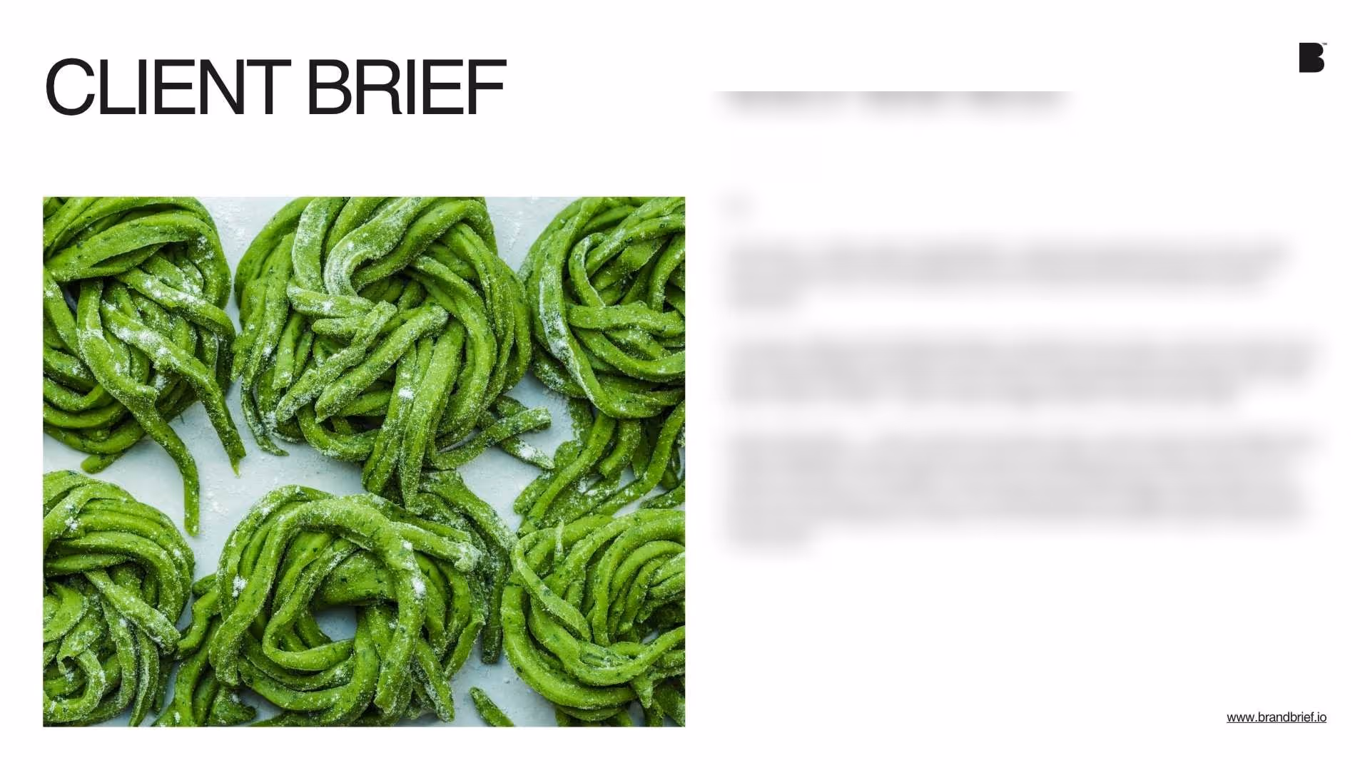
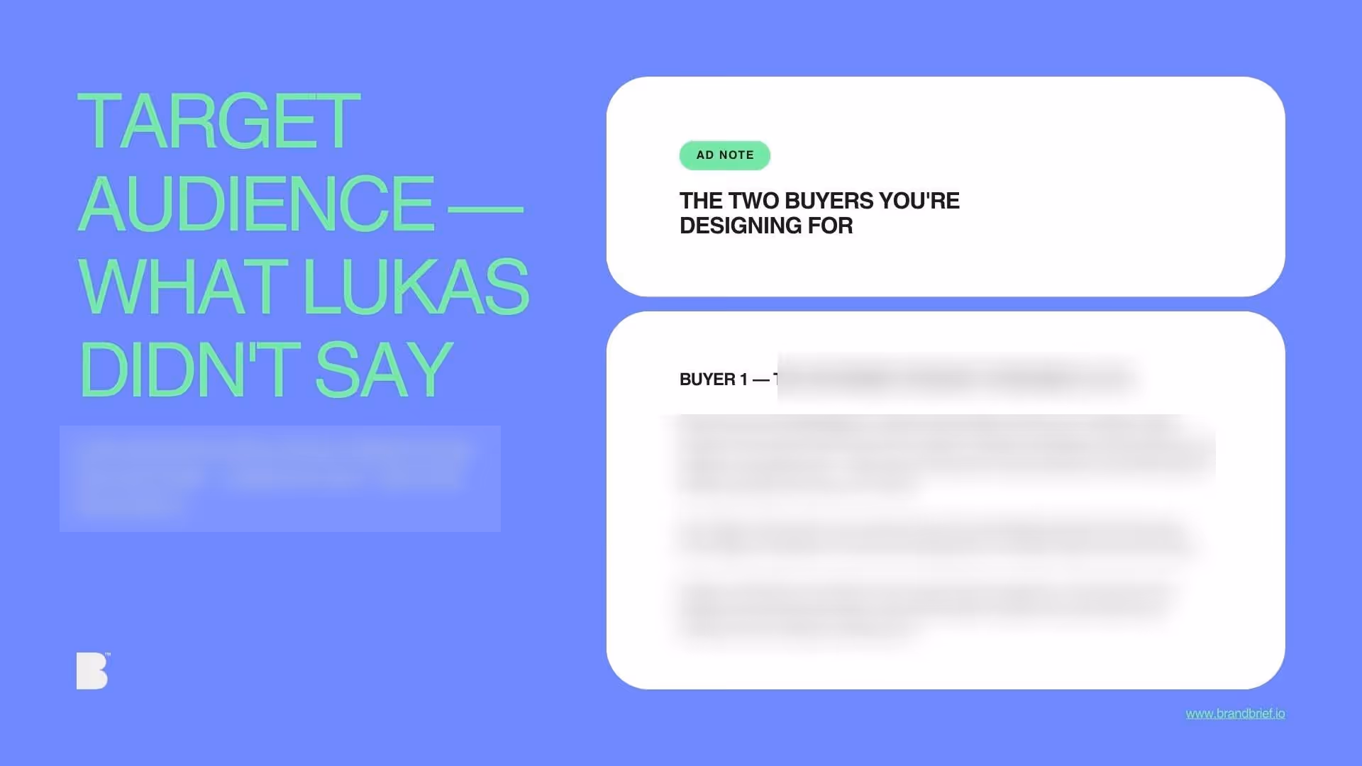
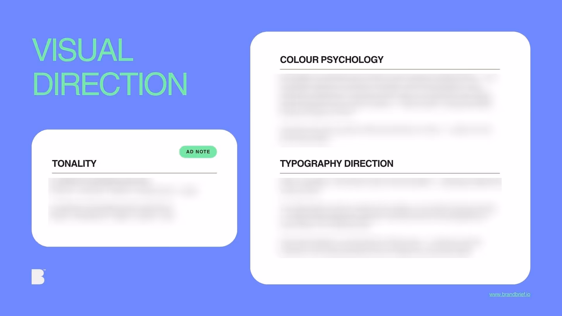
Brand Identity & Packaging design for a market brand transitioning to retail is one of the most instructive briefs a designer can work on — because the constraints are real, the budget is tight, and the client has strong opinions that don't always translate into clear direction. For a pasta brand with a distinct voice and a specific cultural identity, the brief must resolve the difference between packaging that looks affordable and packaging that looks cheap, between illustration that has character and illustration that has a shelf life of one purchase. BRANDBRIEF™ Design Briefs include the full Art Director's Analysis — with a line-by-line reading of what the client actually means, competitive shelf context, colour logic, and the one question to ask before every design decision.
Every brief includes a full Art Director's Analysis — competitive landscape, buyer psychology, visual direction, and the strategic no-go. This is the layer that agencies build internally and never share. Here, it's included.

