Try our pro brand briefs
/
Briefs + AD Analysis
/
Try our pro brand briefs
/
Create fearlessly
/
All about creativity
/
All about effortless design
/
Innovate boldly
/
Create fearlessly
/
All about creativity
/
All about effortless design
/
Innovate boldly
/
Create fearlessly
/
All about creativity
/
All about effortless design
/
Innovate boldly
/
Create fearlessly
/
Food & Beverage

Design Brief,

Ground UP

Plant-Based Meat Alternative — Full Brand Identity & Retail Packaging System

Plant-Based Meat Alternative — Full Brand Identity & Retail Packaging System

Real briefs. Real clients. The strategic layer your design education skipped.

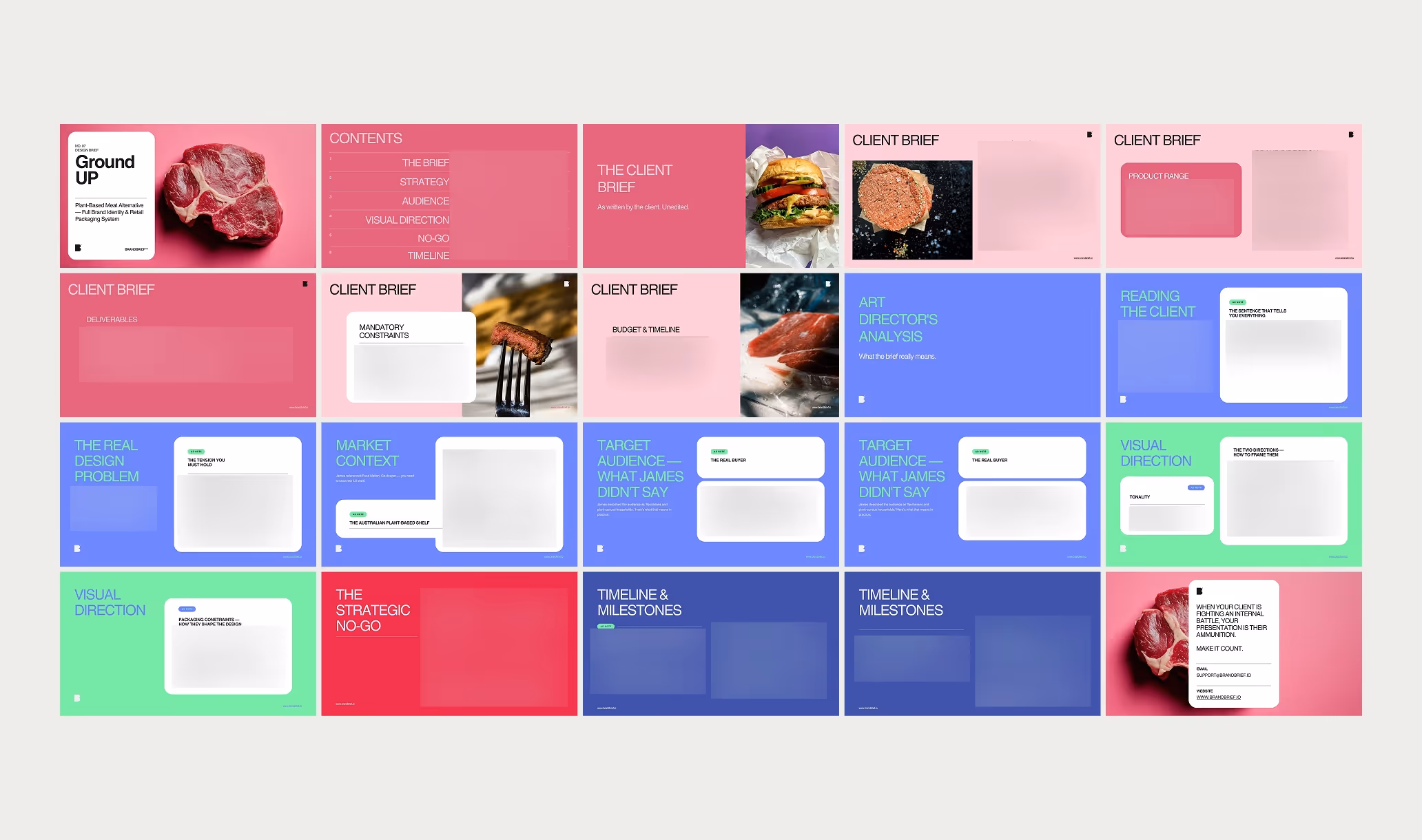
Each pack contains complete briefs, a raw client brief written in the client's own voice, and a full Art Director's Analysis that tells you what it actually means.

WHAT’S INCLUDED

Plant-Based Meat Alternative — Full Brand Identity & Retail Packaging System
Client Brief — written in the client's own voice
Slide titled 'Reading the Client' with a blurred text box on a blue background and a small logo in the corner.
What the client said vs. what they actually mean
Blue background with text 'THE REAL DESIGN PROBLEM' on the left and a white rounded rectangle on the right with the heading 'AD NOTE THE TENSION YOU MUST HOLD'.
The real design problem
Slide with title 'MARKET CONTEXT' on blue background and a white rounded rectangle containing text titled 'THE COMPETITIVE SHELF' with an 'AD NOTE' label above it.
Competitive landscape — direct competitors analysed
Slide titled 'TARGET AUDIENCE — WHAT LUKAS DIDN'T SAY' with a note about two buyers being designed for, displayed on a blue background.
Two buyer personas with psychology
Visual Direction header next to two white rounded boxes labeled Tonality and Colour Psychology with additional text blurred on a blue background.
Visual direction + anti-adjectives
Slide with bright pink background and white text reading 'THE STRATEGIC' with blurred content below.
The strategic NO-go

WHY THE ANALYSIS MATTERS

A client who says "I don't want it to look like every other wellness brand" is giving you a direction. But they're not telling you which wellness brands are on the shelf next to them, who their two most likely buyers actually are, or what the one visual decision is that will make everything go wrong. That's what the Art Director's Analysis is for. It's the brief your client didn't know how to write.
What the client said vs. what they actually mean
The real design problem — not the stated one
Competitive landscape:
who's on the shelf and what the gap is
Two buyer personas with psychology, not demographics
Visual direction: this brand must be. it must never be.
The strategic no-go — the one decision that makes everything go wrong

What you learn

  • How to work with a client who is not the decision-maker — and build the presentation accordingly
  • Why the rationale document is sometimes more important than the design itself
  • How to avoid "vegan" visual codes when the target audience is flexitarian — category language as a design trap
  • How packaging constraints (window position, Health Star Rating) structure the composition before design begins
  • What the difference is between a brand that works on the shelf and one that looks good in a portfolio

WHY DESIGNERS BUY BRANDBRIEF™ Design Briefs

You get the brief agencies never share.

Strategy documents, competitive analysis, positioning rationale — this is the material that stays internal. Junior designers spend years in an agency before they see the full picture behind a project. These packs give you that layer on day one.

You stop designing in a vacuum.

Every brief has a real city, a real shelf, a real deadline, a real client personality. You know why you are making every decision — not just what the deliverable is.

You learn to think before you open a file.

The Art Director's Analysis is not feedback after the work. It is preparation before it. It shows you what the brief actually means, where the traps are, and what the one decision is that makes everything go wrong. That is how senior designers think. This is how you get there faster.

You build portfolio pieces that answer real questions.

Not "here is a rebrand I made up." But: a plant-based brand designed for a supermarket shelf in Australia, a tasting restaurant identity that had to work in two scripts, a charcuterie system across four packaging formats. Work that has context. Work that holds up in a client meeting.

You practice the skill no one teaches.

Reading a client. Every brief in this pack is written differently — some are structured, some are chaotic, one is written by a farmer who has never briefed a designer before. Learning to extract a clear design mandate from any kind of brief is the difference between a designer who waits for direction and one who creates it.

You understand why the good work looks the way it does.

Not "I like this" but "this works because of this, and fails if you change that." The competitive analysis in every pack shows you the shelf your design has to compete on — and the gap it can own.

You get a realistic project timeline.

Every pack includes a milestone plan built around the client's actual deadline and budget. Not a theoretical process. A plan you could hand to a client tomorrow.

TAKE A LOOK INSIDE

Questions?

What exactly is in the Art Director's Analysis?

Each analysis covers: what the client said vs. what they actually mean, the real design problem behind the stated one, a competitive landscape with three direct competitors analysed, two buyer personas with psychology rather than demographics, visual direction including five words the brand must never be, and the strategic no-go — the one decision that makes everything go wrong.

Are these briefs suitable for students?

Yes. The briefs are used by design students, junior designers building their portfolios, and senior designers who want to practice on realistic client scenarios. Each brief is self-contained — no prior knowledge of the industry required.

Can I use these briefs for teaching?

If you're a design educator and want to use briefs in a course or workshop, get in touch at hello@brandbrief.io

What format do I receive?

Each brief is delivered as a downloadable PDF. Available in English.

Is All Access a one-time payment or subscription?

Yes. One payment, permanent access.

Ready to level up?

A professional design brief goes beyond a list of deliverables. The briefs that lead to strong brand identities share three things: a clearly defined competitive position, a specific understanding of who the brand is speaking to, and a strategic direction that makes visual decisions easier — not harder. This is what separates a brief that produces competent work from one that produces work worth putting in a portfolio.

Brand Identity & Packaging design for a mainstream supermarket launch involves constraints that design school briefs rarely include: fixed label dimensions, mandatory regulatory callouts, a clear window that cannot be repositioned, and a stakeholder approval process where the person who briefs the designer is not the person who signs off the work. For a plant-based brand targeting flexitarian households, the brief must also answer a category question: how do you design something that belongs in the meat aisle without looking like a conventional meat brand, and without defaulting to the green-gradient visual language of every plant-based competitor on the shelf. BRANDBRIEF™ Design Briefs include the full Art Director's Analysis — including how to frame two creative directions strategically, how to read the internal politics of a corporate brief, and the single visual decision that determines whether this brand gets picked up or passed over.

Every brief includes a full Art Director's Analysis — competitive landscape, buyer psychology, visual direction, and the strategic no-go. This is the layer that agencies build internally and never share. Here, it's included.