
Italian Spirits Brand — Visual Identity & Label System for Three Products
Real briefs. Real clients. The strategic layer your design education skipped.
Each pack contains complete briefs, a raw client brief written in the client's own voice, and a full Art Director's Analysis that tells you what it actually means.
WHAT’S INCLUDED


WHY THE ANALYSIS MATTERS
who's on the shelf and what the gap is
What you learn
- How to build a label system for three products with three completely different colour worlds that still read as one brand
- Why label architecture — the structural decisions that stay constant — is more important than colour or illustration
- How to communicate genuine place specificity without using the visual codes that every other brand from that place has already used
- What EU spirits labelling requirements mean for label composition — and how to design with them, not around them
- How to present work to a client who has a second, harder audience: a father who built the original and doesn't yet understand why it needs to change
WHY DESIGNERS BUY BRANDBRIEF™ Design Briefs
You get the brief agencies never share.
You stop designing in a vacuum.
You learn to think before you open a file.
You build portfolio pieces that answer real questions.
You practice the skill no one teaches.
You understand why the good work looks the way it does.
You get a realistic project timeline.
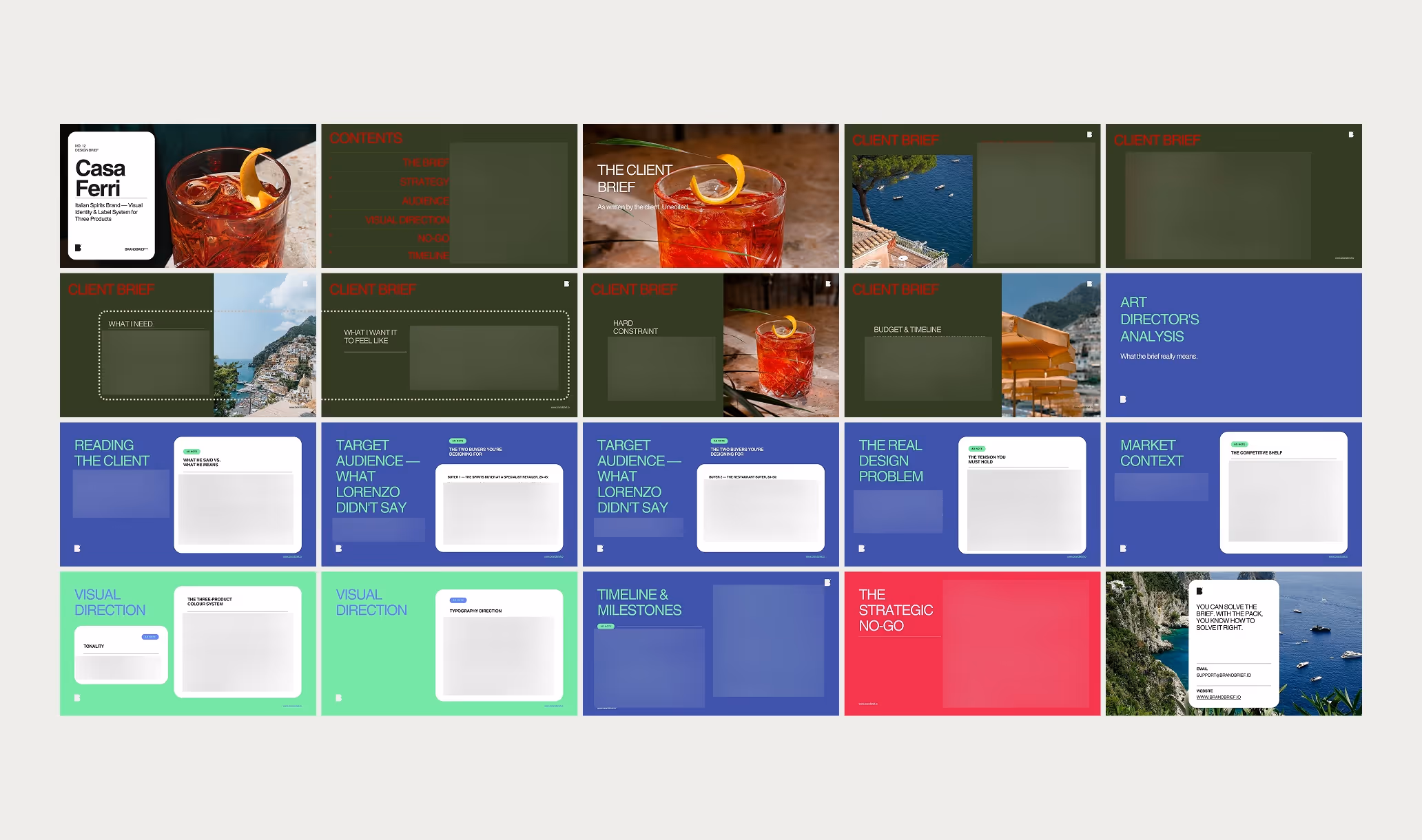
TAKE A LOOK INSIDE
A professional design brief goes beyond a list of deliverables. The briefs that lead to strong brand identities share three things: a clearly defined competitive position, a specific understanding of who the brand is speaking to, and a strategic direction that makes visual decisions easier — not harder. This is what separates a brief that produces competent work from one that produces work worth putting in a portfolio.
Italian spirits branding is one of the most visually contested categories in export food and beverage design. Every producer from the south of Italy has access to the same postcard imagery — cliffside villages, lemon groves, the blue of the Tyrrhenian Sea — and most of them use it. The result is a shelf full of labels that say "Italy" in the way a souvenir shop says "Italy." For a three-generation family producer on the Amalfi Coast entering the German and Austrian market for the first time, the design challenge is not about looking Italian. It is about looking like Casa Ferri — specific, honest, rooted in the particular reality of a coast, a family, and three very different products. BRANDBRIEF™ Design Briefs include the full Art Director's Analysis — covering how to build a label architecture that holds three distinct products as one coherent family, why the colour system should start with the liquid and not the mood board, how to accommodate EU spirits labelling requirements as a design element rather than an afterthought, and how to present work to a client whose father built the original labels and is not sure why they need to change.
Every brief includes a full Art Director's Analysis — competitive landscape, buyer psychology, visual direction, and the strategic no-go. This is the layer that agencies build internally and never share. Here, it's included.

