
Matcha Bar & Retail Concept — Brand Identity, Bar Touchpoints & Retail Packaging
Real briefs. Real clients. The strategic layer your design education skipped.
Each pack contains complete briefs, a raw client brief written in the client's own voice, and a full Art Director's Analysis that tells you what it actually means.
WHAT’S INCLUDED


WHY THE ANALYSIS MATTERS
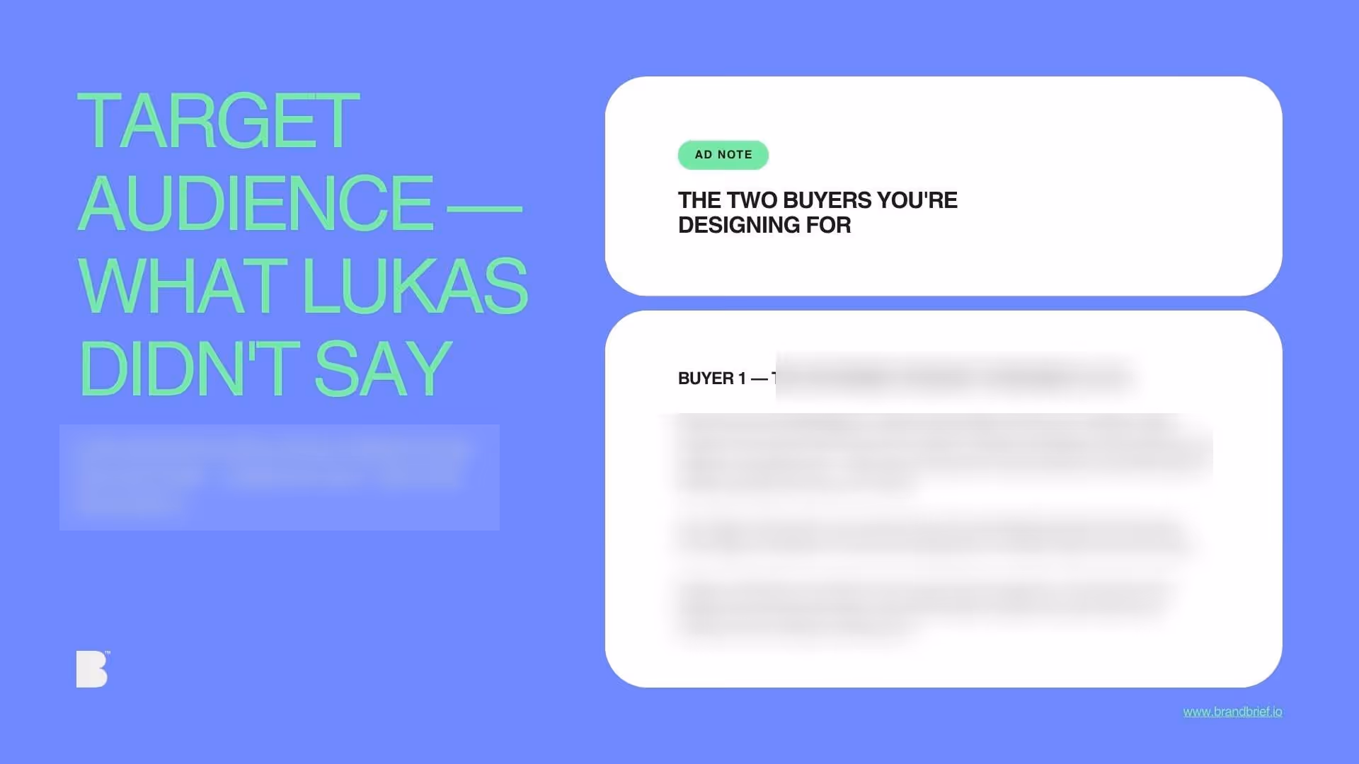
who's on the shelf and what the gap is
What you learn
- How to design one brand for two completely different purchase contexts and buyer psychologies
- Why the cup is not packaging — it is advertising — and what that means for how you design it
- How to resolve a client's stated indecision by identifying the underlying logic they couldn't articulate
- What the difference is between a matcha aesthetic brand and a brand that happens to sell matcha
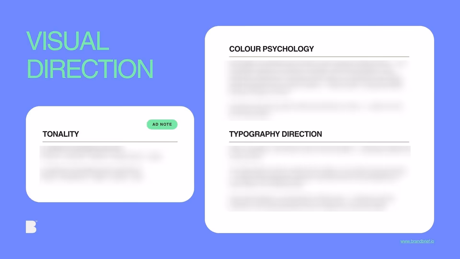
- How to design at two registers — two-second recognition and thirty-second evaluation — within a single visual system
- Why a phased delivery plan is a design decision, not just a project management decision
WHY DESIGNERS BUY BRANDBRIEF™ Design Briefs
You get the brief agencies never share.
You stop designing in a vacuum.
You learn to think before you open a file.
You build portfolio pieces that answer real questions.
You practice the skill no one teaches.
You understand why the good work looks the way it does.
You get a realistic project timeline.
TAKE A LOOK INSIDE

A professional design brief goes beyond a list of deliverables. The briefs that lead to strong brand identities share three things: a clearly defined competitive position, a specific understanding of who the brand is speaking to, and a strategic direction that makes visual decisions easier — not harder. This is what separates a brief that produces competent work from one that produces work worth putting in a portfolio.
Most brand identity briefs are about one context. SHADE is about two simultaneously — a matcha bar where the cup in your hand is the brand, and a retail product line where the tin on your kitchen shelf is the brand six weeks later. Designing a visual system that works at both speeds — two-second recognition at bar distance and thirty-second evaluation at retail distance — requires a different kind of thinking than a single-context packaging brief. It requires understanding that the same brand must express itself at different depths without changing what it fundamentally is. For a first-time founder in one of Seoul's most design-literate neighbourhoods, the stakes are high and the reference folder is too large. BRANDBRIEF™ Design Briefs include the full Art Director's Analysis — covering the resolution of the client's own stated indecision between two directions, why the cup design is the proof of concept for the entire brand, how to avoid the matcha aesthetic while still being specific to the product, and a phased timeline built around a production deadline the bar cannot miss.
Every brief includes a full Art Director's Analysis — competitive landscape, buyer psychology, visual direction, and the strategic no-go. This is the layer that agencies build internally and never share. Here, it's included.

