
Botanical Skincare Brand — Visual Identity & Product Label System
Real briefs. Real clients. The strategic layer your design education skipped.
Each pack contains complete briefs, a raw client brief written in the client's own voice, and a full Art Director's Analysis that tells you what it actually means.
WHAT’S INCLUDED

WHY THE ANALYSIS MATTERS
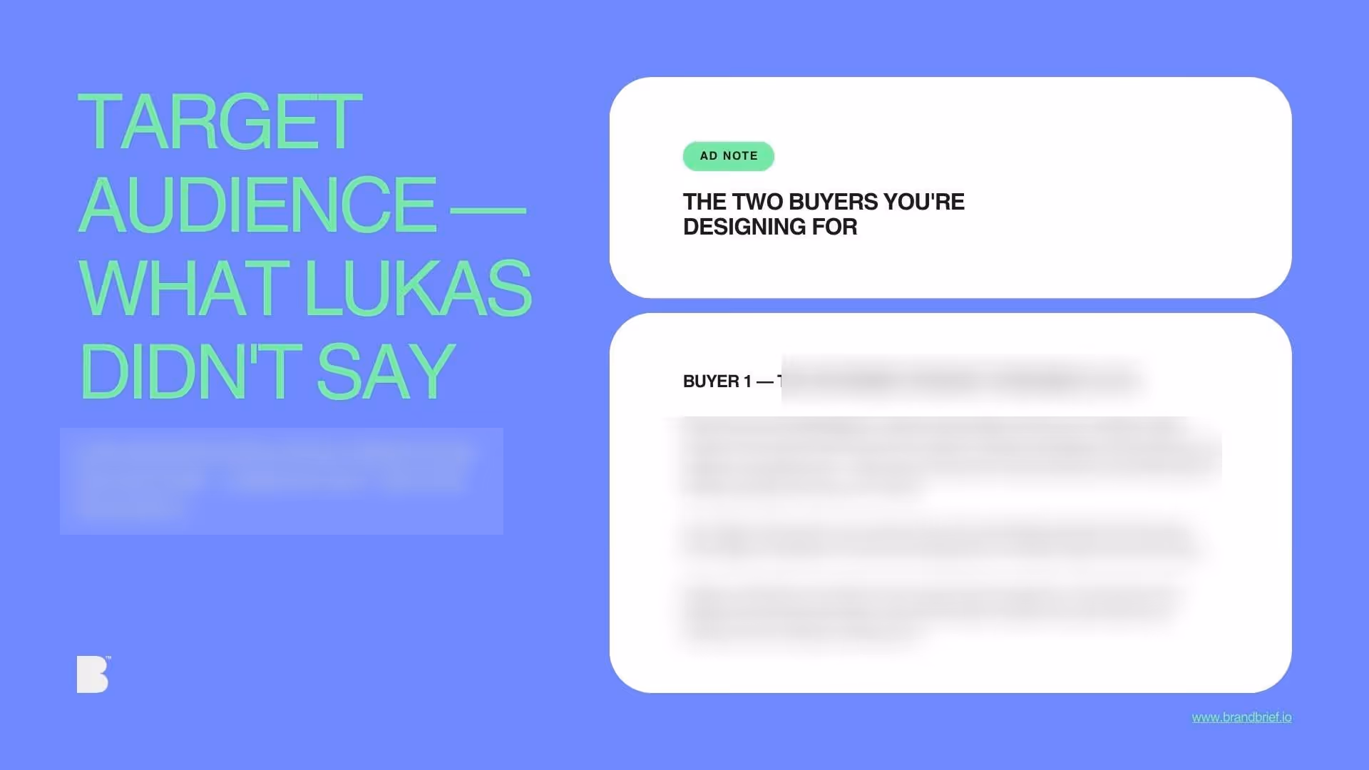
who's on the shelf and what the gap is
Get instant access via monthly subscription or one-time pass.
What you learn
- How to design for a client who knows exactly what she wants — and what that means for how you present your work
- Why the ingredient list on the back label is a design opportunity, not compliance copy
- How to communicate place-specificity without using the visual codes of that place
- What the difference is between scientific design and pharmaceutical design
- How to differentiate three SKUs within a single label system without breaking the family
WHY DESIGNERS BUY BRANDBRIEF™ Design Briefs
You get the brief agencies never share.
You stop designing in a vacuum.
You learn to think before you open a file.
You build portfolio pieces that answer real questions.
You practice the skill no one teaches.
You understand why the good work looks the way it does.
You get a realistic project timeline.
TAKE A LOOK INSIDE

Questions?
Ready to level up?
Get instant access via monthly subscription or one-time pass.
A professional design brief goes beyond a list of deliverables. The briefs that lead to strong brand identities share three things: a clearly defined competitive position, a specific understanding of who the brand is speaking to, and a strategic direction that makes visual decisions easier — not harder. This is what separates a brief that produces competent work from one that produces work worth putting in a portfolio.
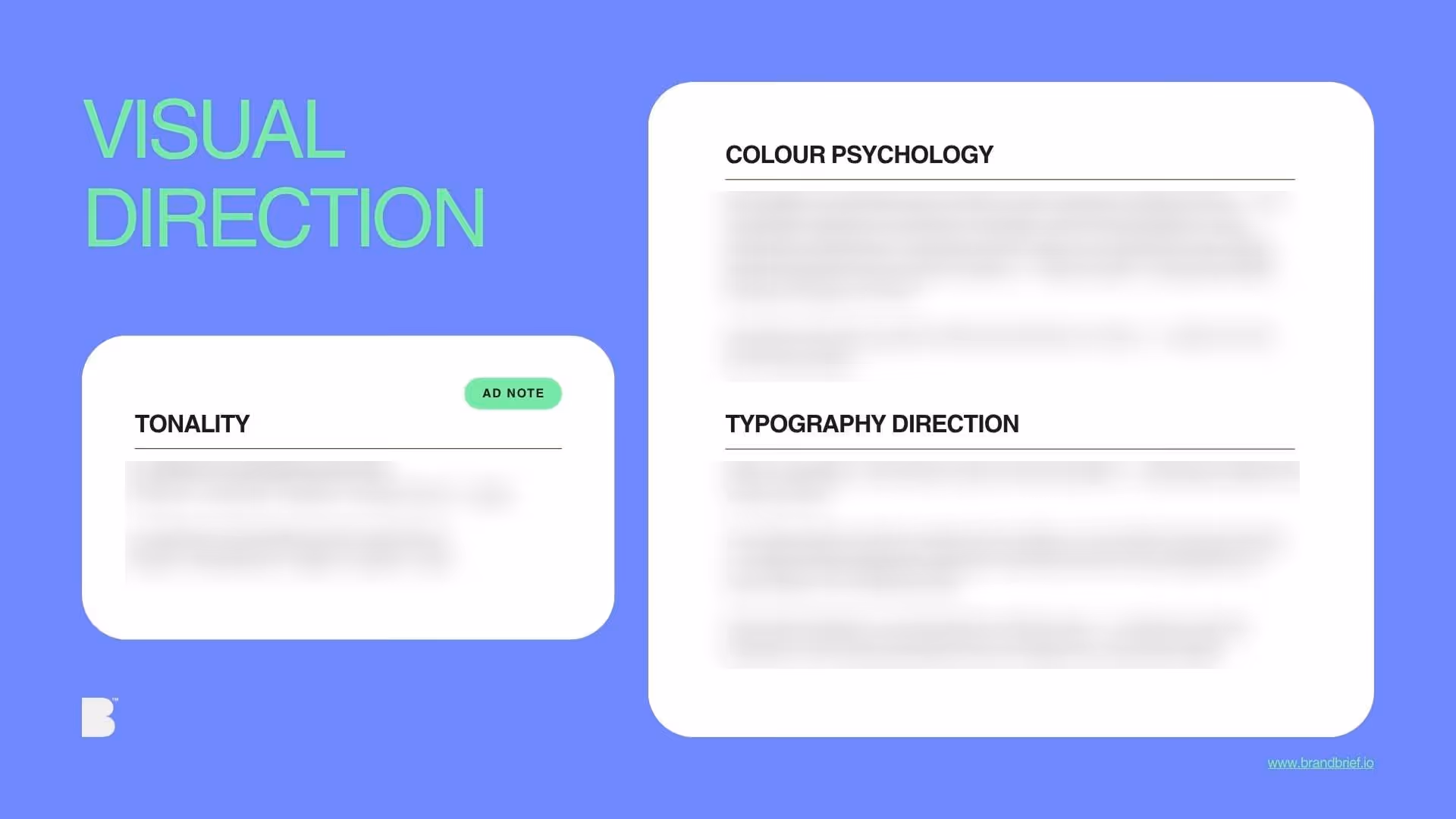
Botanical skincare is one of the most visually saturated categories in independent beauty. Every brand claims natural ingredients, every label shows a leaf, and every founder story ends with the same sentence about connecting with nature. The result is a shelf where the brands that know the most look identical to the brands that know the least. For a biochemist working exclusively with plants from the Cape Floristic Region — one of six floral kingdoms on earth, found nowhere else — the design challenge is not about looking botanical. It is about communicating a level of specificity that most brands in this category cannot claim and would not know how to show. BRANDBRIEF™ Design Briefs include the full Art Director's Analysis — covering why the ingredient list is the primary brand communication for the buyer who matters most, how to pull a colour palette from a real landscape instead of a mood board, what the difference is between scientific design and pharmaceutical design, and why the back label is as important as the front.
Every brief includes a full Art Director's Analysis — competitive landscape, buyer psychology, visual direction, and the strategic no-go. This is the layer that agencies build internally and never share. Here, it's included.

