Restaurant & Café

Design Brief,

Tidal

Coastal Tasting Restaurant — Visual Identity & Brand System

Coastal Tasting Restaurant — Visual Identity & Brand System

Real briefs. Real clients. The strategic layer your design education skipped.

Each pack contains complete briefs, a raw client brief written in the client's own voice, and a full Art Director's Analysis that tells you what it actually means.

WHAT’S INCLUDED

Coastal Tasting Restaurant — Visual Identity & Brand System
Client Brief — written in the client's own voice
Slide titled 'Reading the Client' with a blurred text box on a blue background and a small logo in the corner.
What the client said vs. what they actually mean
Blue background with text 'THE REAL DESIGN PROBLEM' on the left and a white rounded rectangle on the right with the heading 'AD NOTE THE TENSION YOU MUST HOLD'.
The real design problem
Slide with title 'MARKET CONTEXT' on blue background and a white rounded rectangle containing text titled 'THE COMPETITIVE SHELF' with an 'AD NOTE' label above it.
Competitive landscape — 3 direct competitors analysed
Slide titled 'TARGET AUDIENCE — WHAT LUKAS DIDN'T SAY' with a note about two buyers being designed for, displayed on a blue background.
Two buyer personas with psychology
Visual Direction header next to two white rounded boxes labeled Tonality and Colour Psychology with additional text blurred on a blue background.
Visual direction + anti-adjectives
Slide with bright pink background and white text reading 'THE STRATEGIC' with blurred content below.
The strategic no-go

WHY THE ANALYSIS MATTERS

A client who says "I don't want it to look like every other wellness brand" is giving you a direction. But they're not telling you which wellness brands are on the shelf next to them, who their two most likely buyers actually are, or what the one visual decision is that will make everything go wrong. That's what the Art Director's Analysis is for. It's the brief your client didn't know how to write.
What the client said vs. what they actually mean
The real design problem — not the stated one
Competitive landscape:
who's on the shelf and what the gap is
Two buyer personas with psychology, not demographics
Visual direction: this brand must be. it must never be.
The strategic no-go — the one decision that makes everything go wrong

WHY DESIGNERS USE BRANDBRIEF™

Real client voices

Not polished by an agency. Written like clients actually talk — short, long, missing information, full of opinions. Exactly like the briefs you'll receive in your career.

Strategic depth

Every brief includes a full Art Director's Analysis. Competitive landscape, buyer psychology, visual direction, and the one decision that makes everything go wrong.

Immediate application

Download, open, start. Every brief is a complete project you can add to your portfolio — with the strategic thinking to back it up.

English
& German

Every brief is available in English and German. Designed for designers across Europe and beyond.

TAKE A LOOK INSIDE

Questions?

What exactly is in the Art Director's Analysis?

Each analysis covers: what the client said vs. what they actually mean, the real design problem behind the stated one, a competitive landscape with three direct competitors analysed, two buyer personas with psychology rather than demographics, visual direction including five words the brand must never be, and the strategic no-go — the one decision that makes everything go wrong.

Are these briefs suitable for students?

Yes. The briefs are used by design students, junior designers building their portfolios, and senior designers who want to practice on realistic client scenarios. Each brief is self-contained — no prior knowledge of the industry required.

Can I use these briefs for teaching?

If you're a design educator and want to use briefs in a course or workshop, get in touch at hello@brandbrief.io

What format do I receive?

Each brief is delivered as a downloadable PDF. Available in English and German.

Is All Access a one-time payment or subscription?

Yes. One payment, permanent access.

Ready to level up?

A professional design brief goes beyond a list of deliverables. The briefs that lead to strong brand identities share three things: a clearly defined competitive position, a specific understanding of who the brand is speaking to, and a strategic direction that makes visual decisions easier — not harder. This is what separates a brief that produces competent work from one that produces work worth putting in a portfolio.

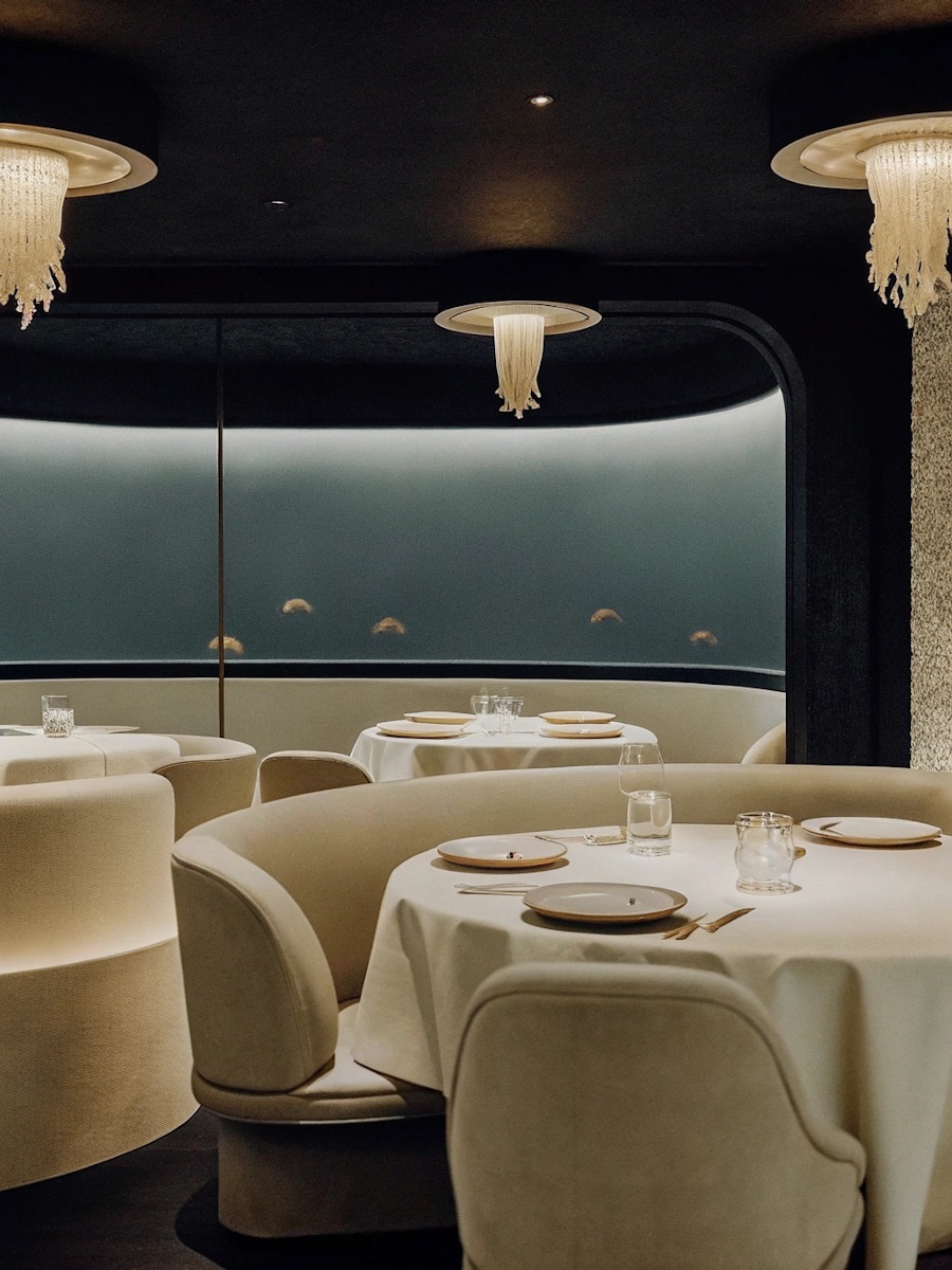
Restaurant brand identity is one of the most complex areas of visual design. A brief for a tasting restaurant must account for physical touchpoints that few other categories require — menus that are handled, signage that is read in low light, a digital presence that must convert a reservation decision in seconds. For a restaurant built around a single sourcing constraint and a fixed menu format, the brief must also resolve a harder question: how do you build a visual identity that carries a specific culinary philosophy without illustrating it. BRANDBRIEF™ Design Brief Packs include the full Art Director's Analysis — covering competitive landscape, buyer personas, typographic direction, and the one decision that makes the difference between a design that feels right and one that just looks good.

Every brief includes a full Art Director's Analysis — competitive landscape, buyer psychology, visual direction, and the strategic no-go. This is the layer that agencies build internally and never share. Here, it's included.